Wet Paint, Dry Wit: The Handwritten Signs That Sell a British Night Out

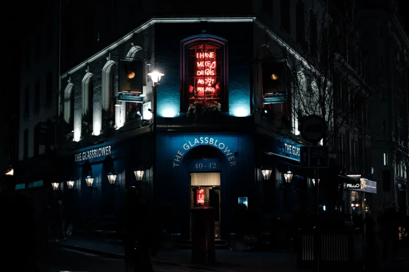
Photo by Photo by Dennis Schmidt on Unsplash on Unsplash
You can learn a lot about a British bar from the state of its signage. A perfectly kerned vinyl decal promises efficiency. A chalkboard with a smudged thumbprint promises something better: a human being was here, possibly at 4pm, possibly in a hurry. In 2026, when every venue can buy a screen and every screen can loop the same cocktail reel, the handwritten notice has become a quiet act of rebellion. It is also, more often than not, the thing that gets you through the door.
The first line of service
A sign is the handshake before the handshake. Long before anyone asks what you are drinking, a board by the pavement has told you whether to relax, whether to book, whether to bring cash, and whether the dog is welcome. Chalk is brilliant at this because it carries the imprint of a decision. Someone stood there, chose a colour, made a mistake, rubbed it out, started again. That tiny performance of effort is persuasive in a way that a laminated list rarely is.
The best British bar signs are not trying to be graphic design. They are trying to be conversation. A neighbourhood pub in Leeds might announce its Sunday roast in block capitals and its new pale ale in a hopeful scrawl underneath. A basement cocktail room off a busy high street might use a single line — ‘stairs down, nerves optional’ — to do the work of a whole welcome speech. The message is not just what is on offer. It is who is offering it.
A hierarchy written in dust
Look closely at a good chalkboard and you will see a hierarchy. The pub name or bar logo sits at the top, steady and readable. The middle belongs to the specials: a new vermouth, a seasonal negroni, a keg that has just come on. The bottom is for the practical business of having a nice time — quiz night, kitchen hours, card payments, dogs, children, the location of the loos.
The typography is usually accidental and all the better for it. Block capitals mean business: ‘NO BOOKINGS’ or ‘KITCHEN CLOSED’. Looping cursive means romance: ‘blood orange, rosemary, soda’. A tiny asterisk can mean the difference between a recommendation and a warning. And the eraser ghosts — those pale grey smears where last week’s special used to be — add a sense of momentum. The menu is alive. It has a pulse.
Humour is the house style
British bar humour tends to be dry, sideways and slightly apologetic. It works best when it is short. A board that says ‘Wine list: red, white, cold’ is funnier than a paragraph explaining the joke. A note that reads ‘Ask about the secret menu. We’ll probably say no’ tells you more about the room than any cocktail list. The point is not to be clever for the sake of it. The point is to signal that the people behind the bar have a personality and are willing to share a fraction of it.
That humour also sorts the audience. A sign that gently takes the mickey out of itself attracts people who are happy to go along with the evening. A sign that takes the mickey out of its customers — even affectionately — can do the same. What rarely works is the corporate meme voice: the forced quirk that feels as if it has been approved by three meetings and a brand consultant. Handwriting forgives a lot. Manufactured whimsy does not.
Basements, boozers and the A-board arms race
Handwritten signs look different depending on where they live. In a tiny basement cocktail bar, the board might be no bigger than a hardback book, propped near the door or tucked beside the till. It can afford to be cryptic: ‘If you can read this, order the daiquiri.’ In a neighbourhood pub, the A-board has to do a harder job. It is competing with bin day, bus stops, delivery bikes and the British weather. It needs to be legible from ten paces and cheerful enough to survive a damp Tuesday.
In areas with a strong independent streak — Manchester’s Northern Quarter, Bristol’s Stokes Croft, Glasgow’s Finnieston, parts of east London — the pavement board has become its own small arms race. Some venues go big, bold and illustrated. Others go minimal, almost invisible. But the handwritten ones still cut through, because they look like they belong to the street rather than to a marketing plan. A LED screen has its place: listings, sports fixtures, accessibility information. It just does not flirt.
Why LED loses to a shaky line
A screen is static perfection. A chalk scrawl is time-stamped. It tells you the kitchen just got rhubarb, the bartender made a new syrup, the quiz is tonight, the beer is off, the back door is open. The medium carries the message: this is fresh. It also carries a useful hint of vulnerability. Chalk in a British winter will smudge. Marker pen on a rainy A-board will run. A sign that has survived the weather feels like it has earned its place.
There is a practical charm to the last-minute notice, too. The sheet of paper taped to the door — ‘Cocktail of the day: leftover rhubarb, trust us’ — is a small act of improvisation. It cannot be scheduled in advance. It cannot be posted by an algorithm. It simply exists because someone had an idea and a spare bit of card. That spontaneity is increasingly valuable in a night-out culture that otherwise arrives pre-packaged, pre-filtered and pre-booked.
How to read a chalkboard like a regular
Start with the underlines. An underlined special is usually the thing the bar wants you to try. Look for the eraser ghosts: if the board has been rewritten recently, something has changed. Check the bottom corner. That is where the useful details hide — dogs welcome, cash preferred, kitchen closes at nine, quiz starts at eight. All caps mean pay attention. Tiny writing often means the best information is being shared quietly.
A board with no prices at all is either very confident or slightly worrying. A board with too many prices is a spreadsheet in disguise. The sweet spot is a sign that tells you what to order, where to sit and whether to settle in. If it makes you slow down before you speed up, it has done its job.
The sign as the first round
Next time you are choosing between two bars on the same street, read the boards before you read the reviews. A handwritten sign is not a guarantee of a good night, but it is a decent clue about the sort of night you are walking into. It says whether the room is curious, chaotic, cosy or composed. It says whether the people inside are trying to sell you something or invite you in.
In 2026, polish is cheap and personality is not. That is why the best British bar signs are still handwritten, still slightly wonky, and still doing the most important job in hospitality: making you feel like you have arrived somewhere real. Chalk it up to human nature. A shaky line can be more persuasive than a perfect screen.